
This essay was originally published in the OER textbook The Western World, Daily Readings on Geography by Joel Quam and Scott Cambell, published by the College of DuPage Digital Press. Thank you to Professor Quam for inviting me to contribute this essay to this publication. I am sharing it here for my students.
MAPPING AS A WAY TO SEE
In 1974 the French author Georges
Perec sat in the place Saint-Sulpice in Paris for three days and recorded
everything he saw. His quirky essay “An Attempt at Exhausting a Place in
Paris” reads like a laundry list of mundane observations. But as one
progresses through the text a kind of rhythm is slowly revealed. Through his
observations of the mundane, Perec brings to life the spirit of a place, its
rhythms, pulsations, and attributes that makes real places and spaces
memorable. Perec himself said that his attempt was to describe “that
which is generally not taken note of, that which is not noticed.”1 By
observing the often overlooked aspects of everyday life, a deeper understanding
of a place emerges.
What Perec was doing was making a
kind of map. Not necessarily a literal map like we might think of, but
rather a deep observation and record of a place. Architects are
interested in the ways in which they can come to truly understand places and
spaces in the built environment. Mapping, the act of recording and observing,
is one method we can employ to understand and see places more clearly.
Architecture students are
encouraged to use mapping as an analysis tool before beginning any design
work. The idea is to look deeply at a place, observe, record, and
analyze. This is an essential first step in the design process that occurs
before any concept sketch or design gesture has been considered. The idea
is that a deeper understanding of place and space will lead to more authentic
and sensitive design responses to a given place.


Students in the Architecture 2201 Design I class use mapping exercises as a part of site analysis research before design begins. Photos by Mark A. Pearson.
Taking Chicago as a model, mapping
can reveal and help us see and understand a place. It can also raise
important questions for a designer to consider.
Architects often use types of maps known as figure grounds. Figure ground maps are graphically beautiful. Simplifying an urban environment into buildings (figure) and space (ground) can reveal patterns of development, scale and density. Overlay this same type of map with highlights of public parks and open space can reveal another type of pattern. These mapping activities also raise questions. Where are the public spaces in a city? Who has access to them?


Image 1,2: Figure ground maps created using open source data from the Chicago Data Portal. Image 3: Running data from flowingdata.com.
Traffic maps can reveal the movement and flow of people and products (and also tell you where not to drive), but have you ever looked at illustrative maps of fitness tracker activities? These beautiful maps reveal an entirely different pattern of use, leisure, and fitness within an urban environment. For an example, go to https://flowingdata.com/2014/02/05/where-people-run/#jp-carousel-33724 2 By slightly shifting the way we look at a city, we can begin to see anew. The maps equally force us to ask questions about who has access and proximity to public parks, trails, and open space.
Mapping can also help us understand
deeper social justice issues and reveal uncomfortable histories. In June 2020,
WBEZ Chicago public radio published an essay on where banks have invested money
through lending (mortgages) in the city, and where they have not.3
The centerpiece of this article is a striking data visualization map which
overlays the inequities of lending practices over neighborhood racial
data. With striking clarity, it reveals the disparities that exist.
Shockingly, these are not redlining maps from the 1930s and 1940s, rather,
these maps reveal contemporary data collected from 2012 to 2018 which
illustrate the lack of investment in poor and minority neighborhoods. Mapping,
in this sense, is an activity that reveals. It forces us to encounter
difficult truths about structural inequities within the urban environment.

The City of Chicago has an open
source data portal tool that you can use to view and create your own mapping
analysis projects.4 In the Chicago Data Portal you can find
maps illustrating datasets on everything you can imagine from crime to fire
station locations, bike racks, abandoned vehicles, green roofs, grocery stores,
urban farms, libraries, parks, red-light cameras, pothole repairs, and so
on. You can use the data set tools to create your own mapping
combinations and analysis. For example, draw a map that compares
farmers' market locations to affordable rental housing, thus linking two things
that are fundamental to human life, the needs for shelter and food.
Unsurprisingly, there is a visible disconnect between affordable housing
locations and access to fresh produce in the City of Chicago, such that areas
with lower cost housing often are food deserts that lack fresh fruits and
vegetables. Mapping in this way can help us understand the concept of
food deserts by revealing spatial inequities. Mapping can help us ask the
right questions. Who has access to fresh produce? Who does
not? Why?
So what does this have to do with Architecture
and Design? Well here are a few examples.
In 2012 Chicago Architect Katherine Darnstadt, in partnership with Architecture for Humanity Chicago, transformed a decommissioned CTA bus into a mobile produce market.5 Called “Fresh Moves,” this project transformed a city bus into a mobile farmers' market on wheels. It was designed to both raise awareness to the issues of food deserts within the City of Chicago, as well as to provide access to fresh produce for communities that lack that access to fresh nutritious food.
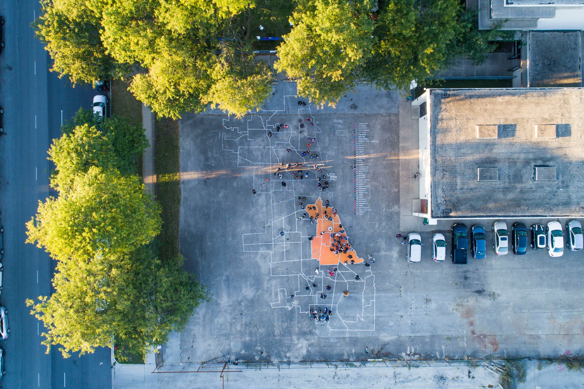
Ben Kolak, Courtesy Borderless Studio. This map
of Chicago is painted in the parking lot of the former Anthony Overton
Elementary School, highlighting 45 CPS school closures by neighborhood.
Chicago based designer and educator
Paola Aguirre Serrano, founder of the firm Borderless Studio provides another
example. In her project titled “creative grounds”, Aguirre Serrano addresses the
issue of repurposing closed Chicago Public Schools.6 Part design
project, part installation art, this project features a larger than life map of
Chicago that was painted in the parking lot of the former Anthony Overton
Elementary School, highlighting the neighborhood locations of over 45 CPS
schools that have closed since 2013 due to budget cuts. This larger scale
interactive map (you can walk on it) is a tool used to reveal. It is also
used by the design team as a tool to spark dialogue about the topic of school
closures and to solicit inclusive responses regarding the future repurposing of
these structures.7 In this
project, a map becomes the catalyst and a key element of a project that
attempts to instigate inclusivity and collaboration around the difficult and
politically charged topic of school closures.
This
map, and the resulting dialogue sessions, had the added benefit of creating a
network of community partners. Anthony
Overton school is located in the heart of the Bronzeville neighborhood in
Chicago. In 2020 when the combination of
pandemic and protest shut down many community grocery stores, this community
partner network was leveraged to set up a rapid response food distribution
center in the former school to assist neighbors who had no access to food in
close proximity. Architecture firms like Borderless studio believe that design professionals
should be discussing issues of design justice and asking questions like “Who
benefits from design? Who gets the burden?”8
Maps are not just static illustrations. They are reflections of those who create them, and at best can be used as active tools to see and understand. The act of mapping can reveal, raise questions, illustrate, provide analysis, and ultimately help us to see, like George Perec, that which might otherwise remain unseen. For designers (and future design professionals), this ability to see and understand the spirit of a place is an essential component to the creation of meaningful, authentic design solutions, especially those solutions that attempt to make the built environment we all share a better place for everyone.
Did you know?
The city of Chicago is organized like a giant piece of graph paper, with the zero-zero point located at the intersection of State and Madison Streets. State and Madison streets are also the dividing line between North and South and East and West Street addresses. This giant Cartesian grid helps make the city logical and navigable. A typical Chicago city block is 660 feet. Every 800 street addresses (8 city blocks) equals a mile. Going North, Chicago Avenue (800 N) is one mile north, North Avenue (1600N) is two miles north, and Fullerton Ave (2400N) is three miles north of the city center. The same pattern works going west, with Halsted, Ashland, and Western Avenue each located at one mile intervals. There are some anomalies to this grid system, but for the most part Chicago, like the entire Midwest, is organized on a mathematical grid system based on one mile squares.
Cited and
additional bibliography:
1Georges
Perec, and Marc Lowenthal. 2010. An Attempt at Exhausting a Place in
Paris. Cambridge, Mass. ; New York: Wakefield Press.
2Yau,
Nathan. 2018. “Where People Run in Major Cities.” FlowingData. October 19,
2018. https://flowingdata.com/2014/02/05/where-people-run/.
3Loury,
Linda Lutton, Andrew Fan, Alden. 2020. “Home Loans in Chicago: One Dollar To
White Neighborhoods, 12 Cents To Black.” Interactive.Wbez.Org. June 3, 2020.
https://interactive.wbez.org/2020/banking/disparity/.
4“City of
Chicago | Data Portal | City of Chicago | Data Portal.” n.d. Chicago.
https://data.cityofchicago.org/.
5Darnstadt,
Katherine. n.d. “Fresh Moves.” Latent Design. http://www.latentdesign.net/.
Accessed June 5, 2020. http://www.latentdesign.net/fresh-moves.
6Serrano,
Paola Aguirre. n.d. “Anthony Overton.” Borderless Studio.
https://www.borderless-studio.com/. Accessed June 5, 2020.
https://www.borderless-studio.com/overton.
7“HOME.”
2017. Creative-Grounds. 2017. https://www.creativegrounds.org/.
8Keane, Katherine. 2019. “Borderless Studio Next Progressives.” Www.Architectmagazine.Com. Architect Magazine. November 4, 2019. https://www.architectmagazine.com/practice/borderless-studio_o.
